")
")
Praforte: birra artigianale
Praforte è una birra artigianale prodotta in Friuli Venezia Giulia (nord-est dell'Italia) recuperando antichi luppoli autoctoni.
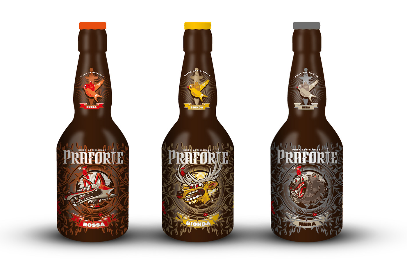
Le nuove etichette dovevano trasmettere la naturalità e richiamare il luogo e la sua storia. Bisognava differenziare le tre tipologie di birra (bionda, rossa e scura) e irrompere nel mercato della birra con un packaging di carattere.
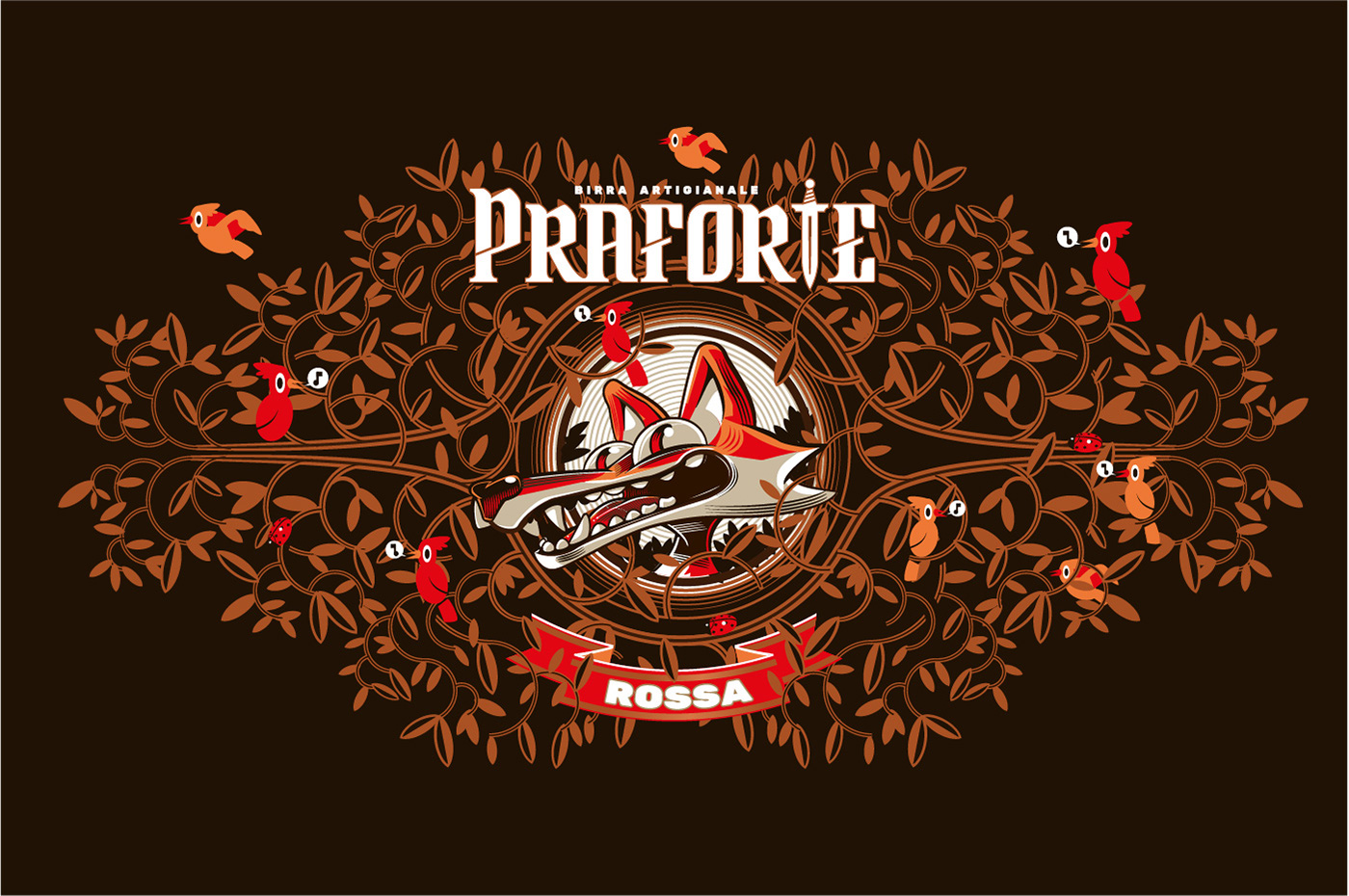
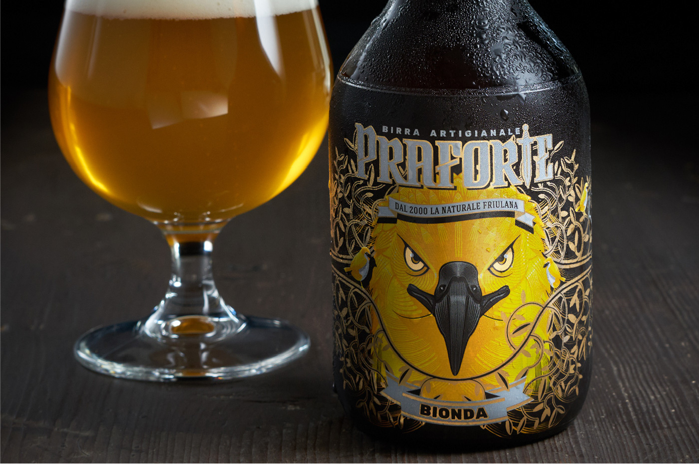
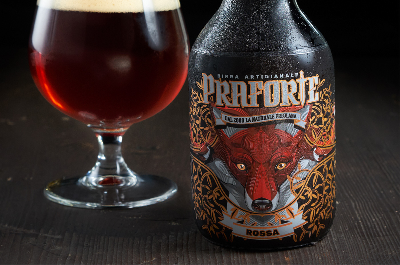
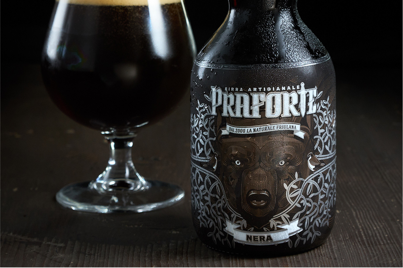
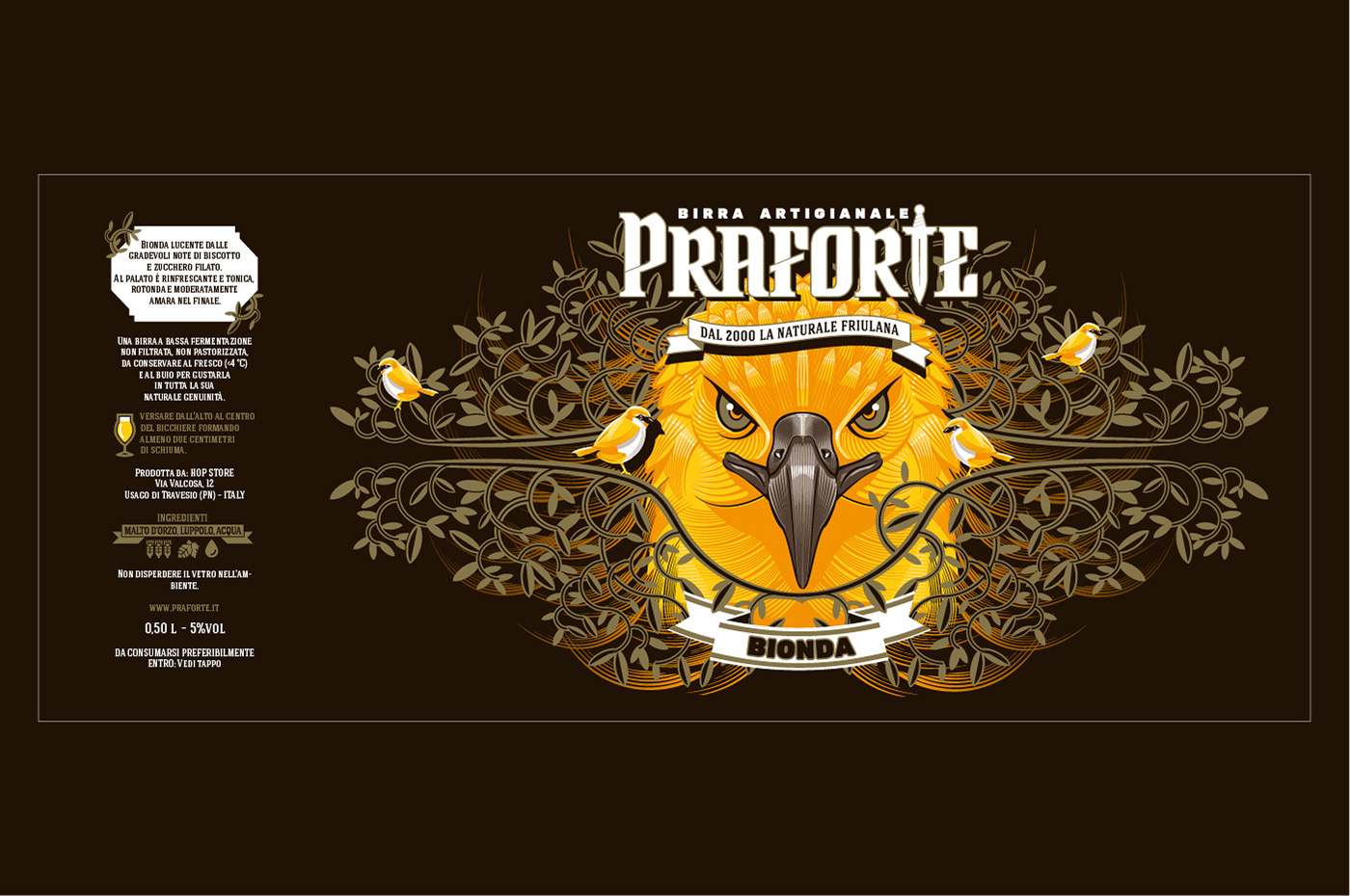
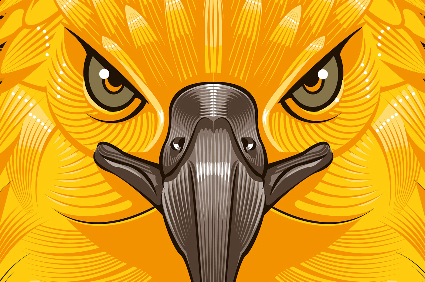
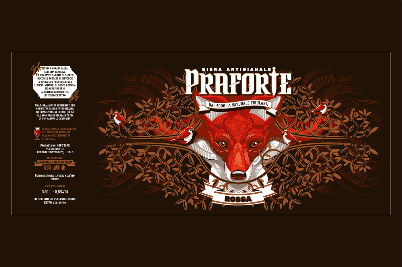
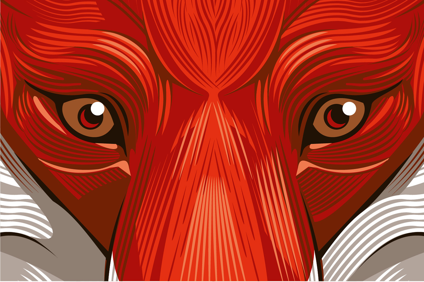
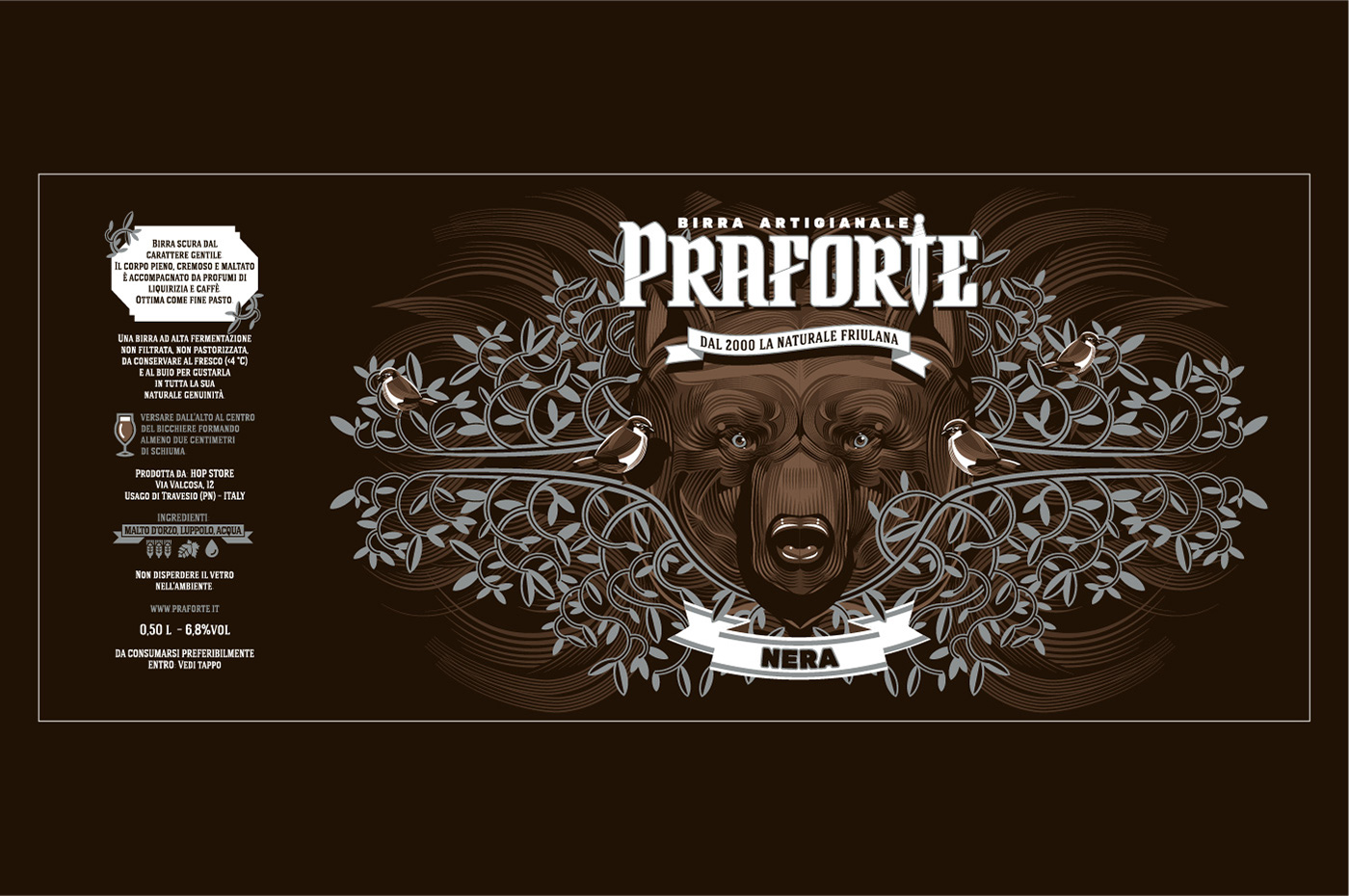
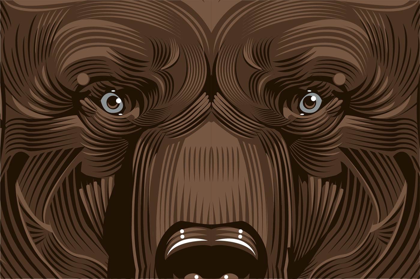
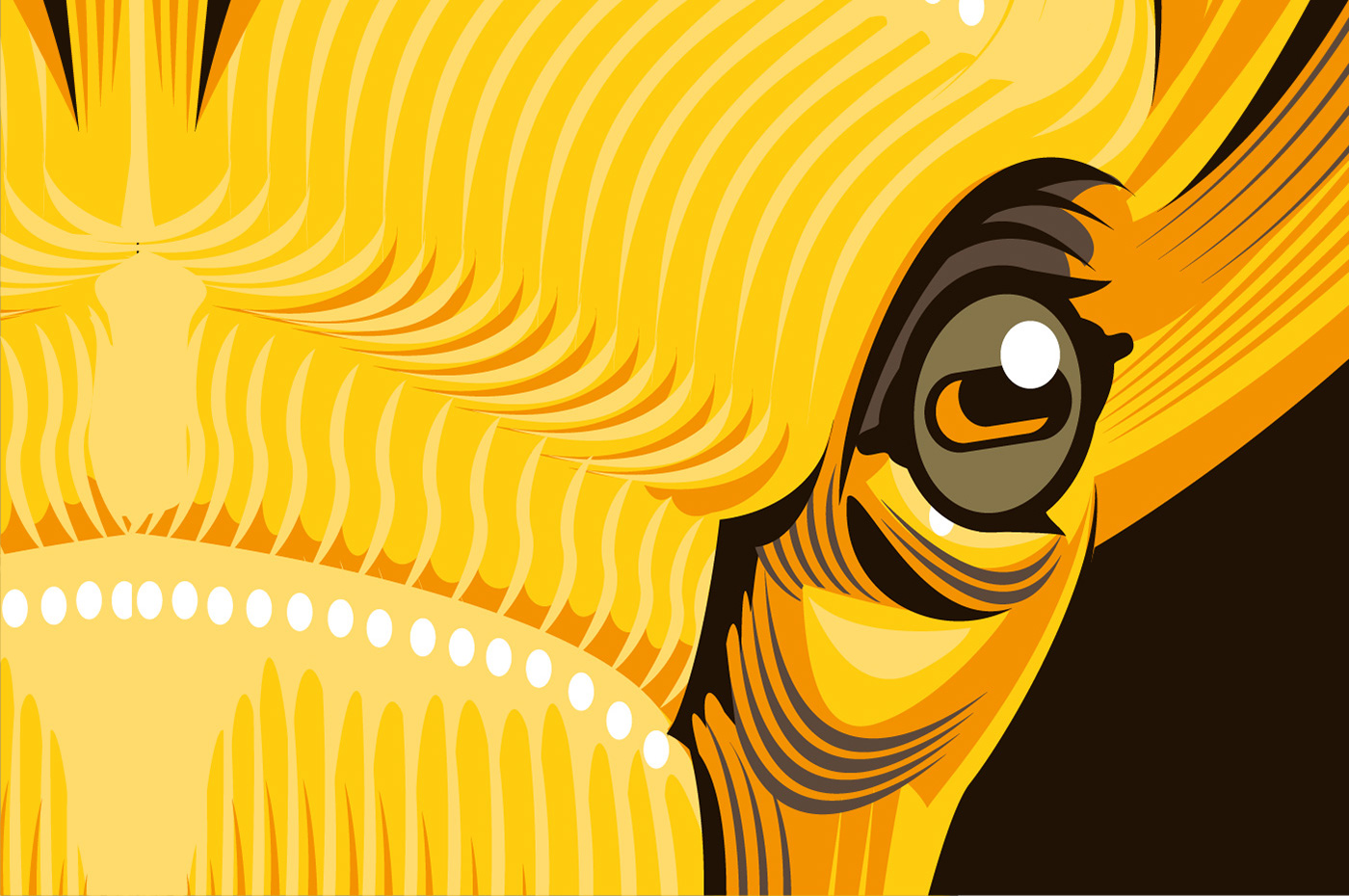
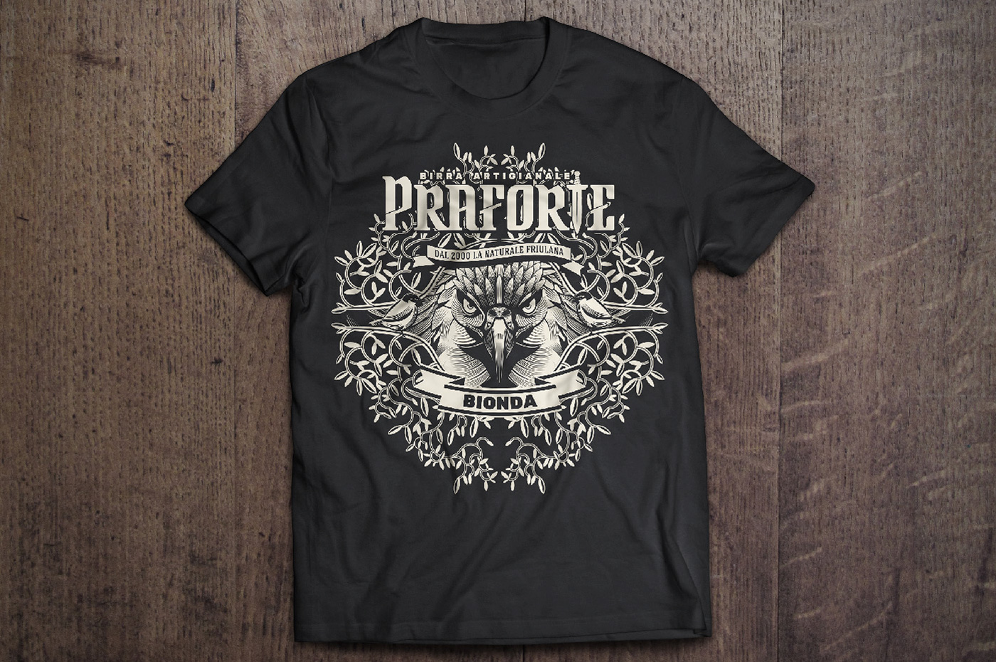
Abbiamo individuato tre animali simbolo del luogo: l'aquila friulana (che è simbolo della regione) per la birra bionda, la volpe per la birra rossa e l'orso bruno per la birra scura. Ogni animale rappresenta anche lo spirito della birra e le sue note di sapore. Gli animali sono stati ritratti in primissimo piano con un close-up che mette al centro lo sguardo penetrante.
La texture di rami e foglie che circonda la testa dell'animale, e dove trovano spazio simpatici uccellini, sono state declinate in oro per la bionda, bronzo per la rossa e argento per la scura.
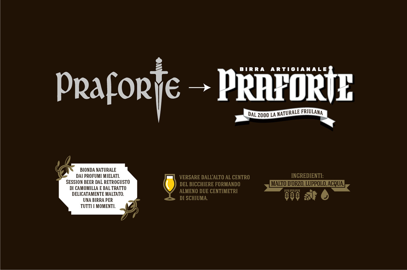
Con l'occasione anche logo e pay-off hanno subito un restyling.
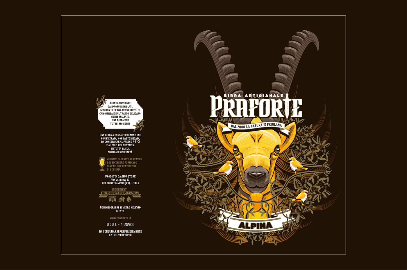
La gamma di birre è stata completata da una birra da aperitivo chiamata Alpina che per questo suo carattere leggero abbiamo associato agli stambecchi che si trovano sulle cime delle Dolomiti e gli abbiamo dato una bottiglia più snella e slanciata.
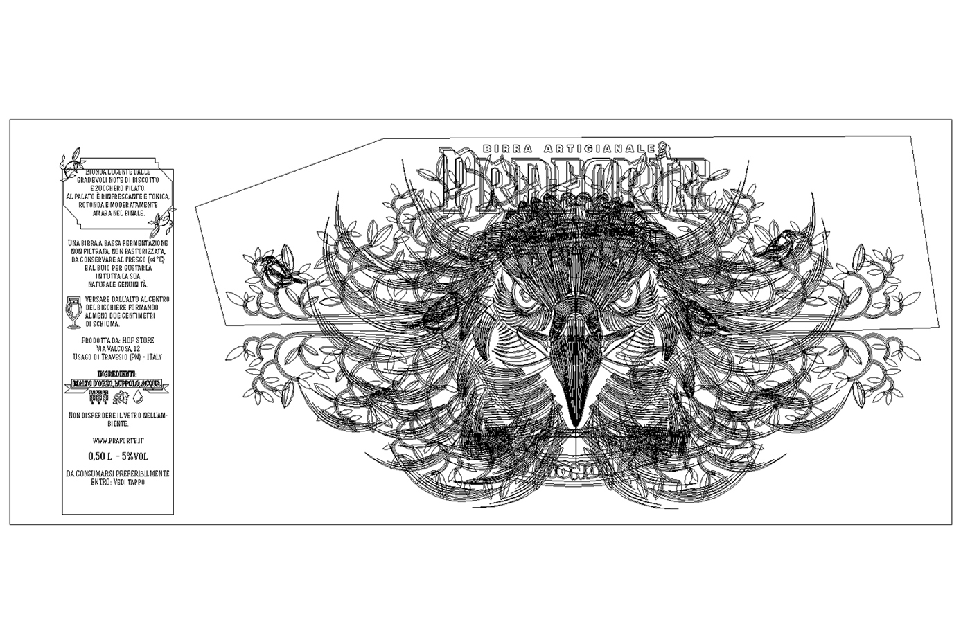
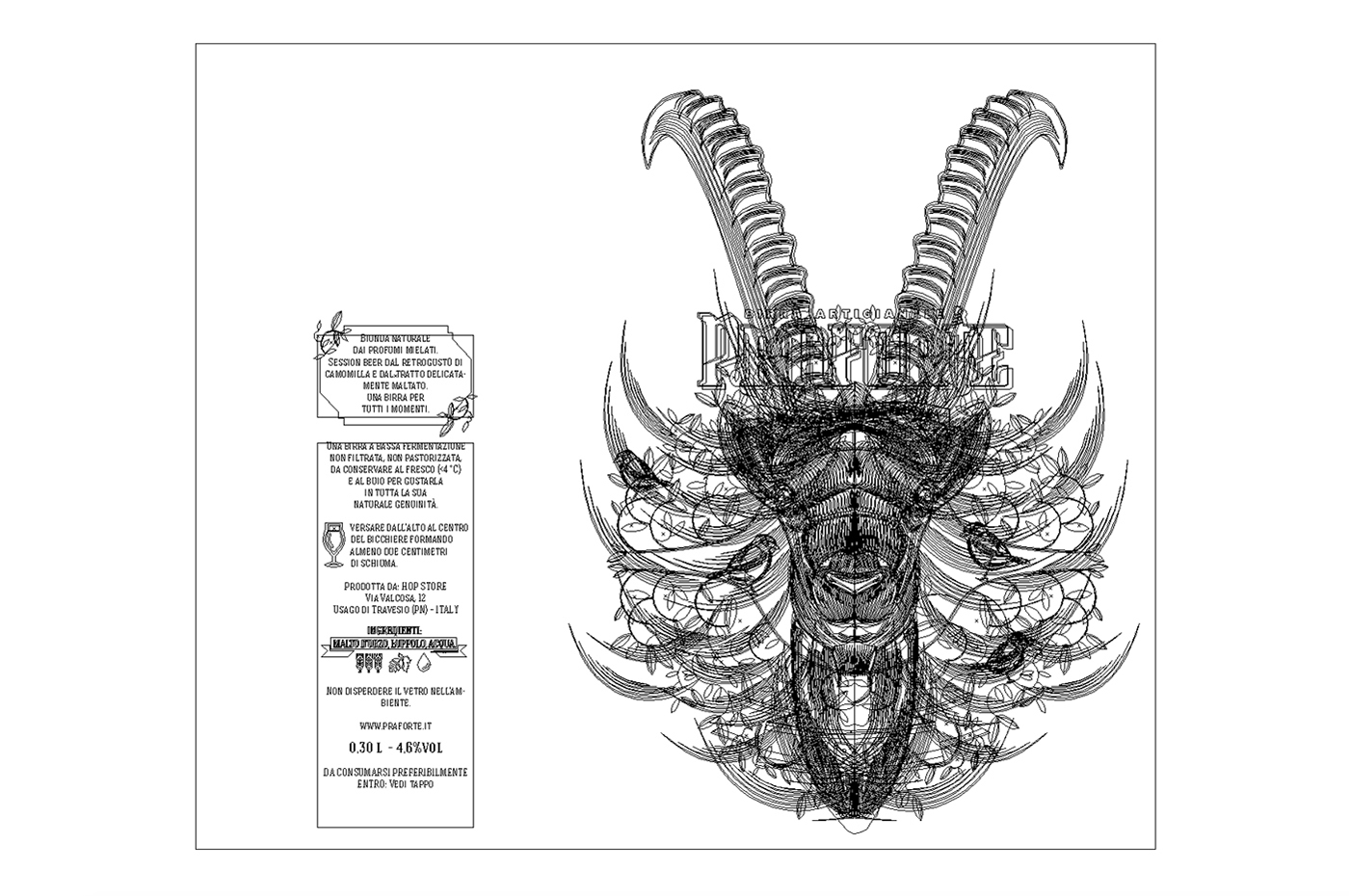
Ogni elemento delle illustrazione è stato disegnato rigorosamente in vettoriale così da poter produrre agevolmente gadget (t-shirt, tovaglie, poster,...) e advertising anche su grandi dimensioni.
Il cliente ha potuto scegliere tra una versione "seria" e una "shock" che mostriamo in questa gallery.
Praforte is an artisan beer produced in Friuli Venezia Giulia (north-eastern Italy) recovering ancient native hops.
The client request for these new labels were to transmit the beer and the place and history. We had to differentiate three types of beer (blonde, red and dark) and break into the beer market with a great packaging.
We have identified three animals symbol of the place: the Friulian eagle (which is a symbol of the region) for the blond beer, the fox for the red beer and a brown bear for the dark beer. Each animal also represents the spirit of the beer and its flavor notes. The animals were painted as a close-up focuses on the penetrating gaze.
The foreground is made of branches and leaves texture where there are little birds. We chose gold for the blonde, bronze for the red and silver for the dark.
Because of this occasion also logo and pay-off had been restyled.
A fourth beer completes the range: it's a light beer perfect as appetizer called Alpina. Because of his slight character we associated it to the Dolomites' ibex on a slimmer and slender bottle.
Each element of illustration was strictly drawn in vector to easily produce gadgets (t-shirts, tablecloths, posters, ...) and advertising of huge dimensions.
The customer had to choose between a version of "serious" and "shock" one that you can see in this gallery.


Birre Praforte - Seconda proposta
Questa seconda proposta ritrae gli stessi animali e colori ma in una versione più simpatica e anticonformista proposta al cleinte perché perfetta per un target giovane.
Birre Praforte - Second version
This version shows the same animals with the same colors but in a funny ways perfect for a young target.